Building Retro Effects
Grade the Plate First
Every effect here is contrast-dependent. ScanLines darken alternate lines, a CRT vignette needs brightness in the corners, RGB Shift needs color to separate. Feed them a flat source with a strong color tint and they do almost nothing — usually why a first attempt looks weak.
So Color Correction goes first, and the job is to neutralise rather than beautify: pull the tint back toward neutral, keep contrast gentle, leave headroom. The effects under it add plenty of their own.
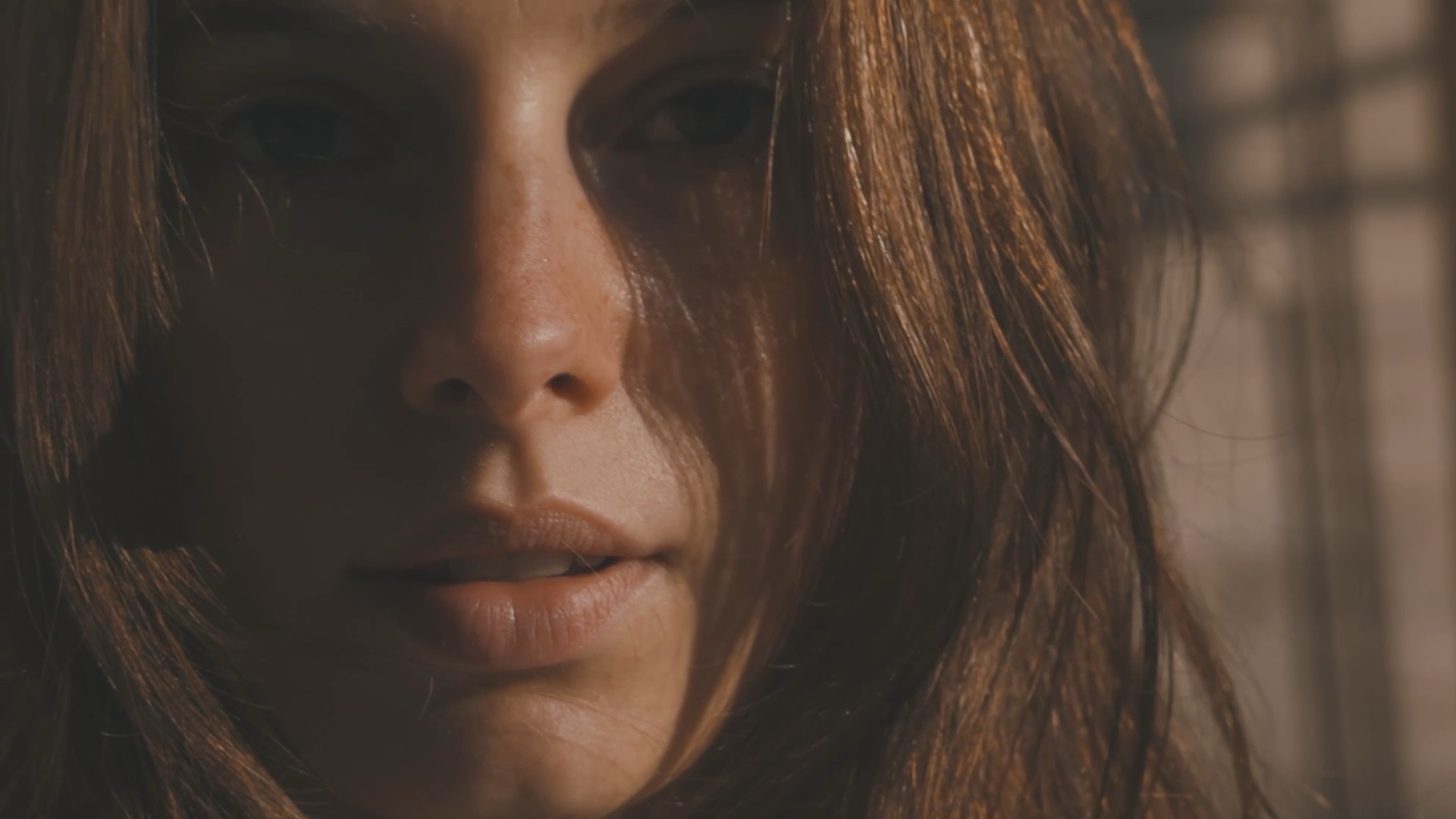
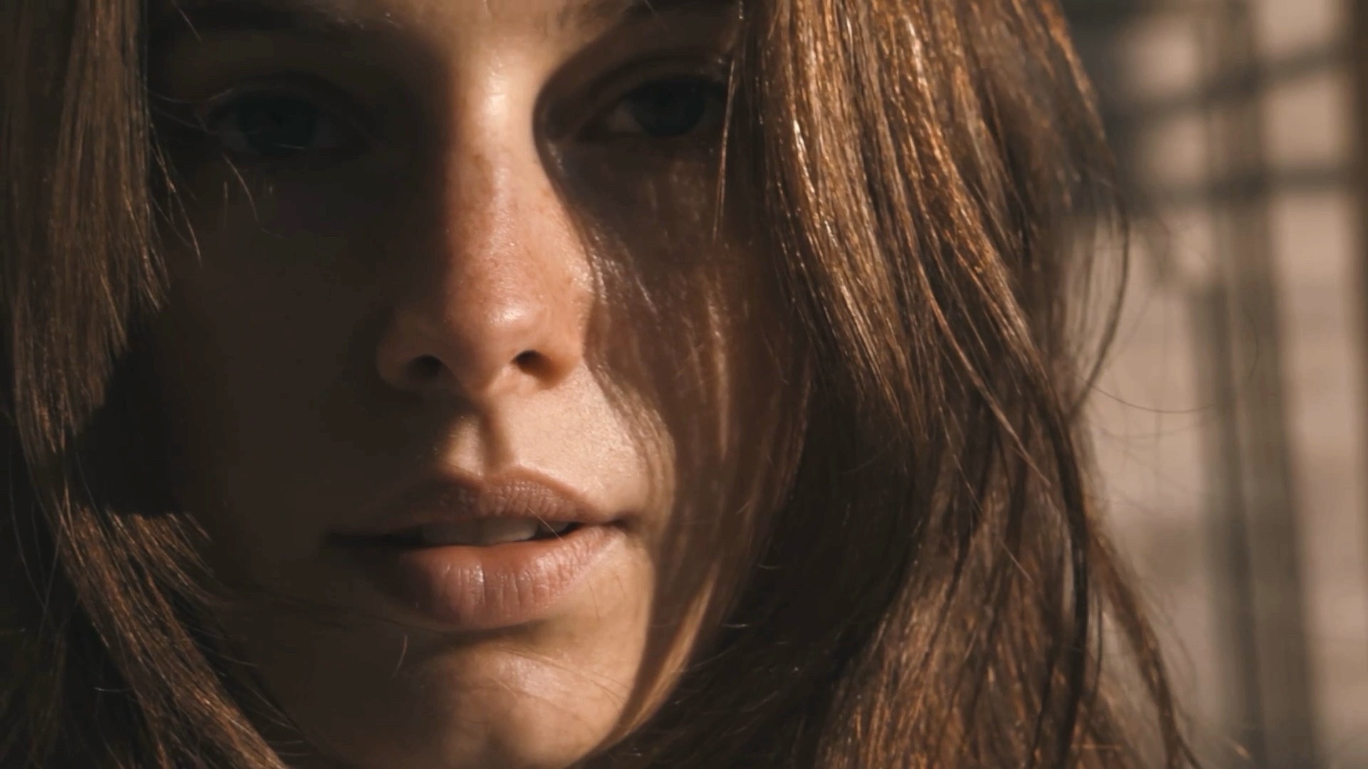
VHS
Tape artefacts: dropout bars, chroma noise, head-switching smear, and the on-screen furniture a VCR stamps over the picture. The most complete effect here — on its own it gets you most of a convincing tape look.
Text is the opacity of the PLAY indicator and timestamp overlay — 0 hides it. Static is the chroma noise floor, Bars the dropout streaks.
Text 1 and Text 2 replace the auto-generated timestamp with your own strings — useful across a sequence, where the live clock would otherwise keep changing.
RGB Shift
Separates the color channels spatially — the chroma misregistration you get from a badly-aligned tube or a cheap composite cable.
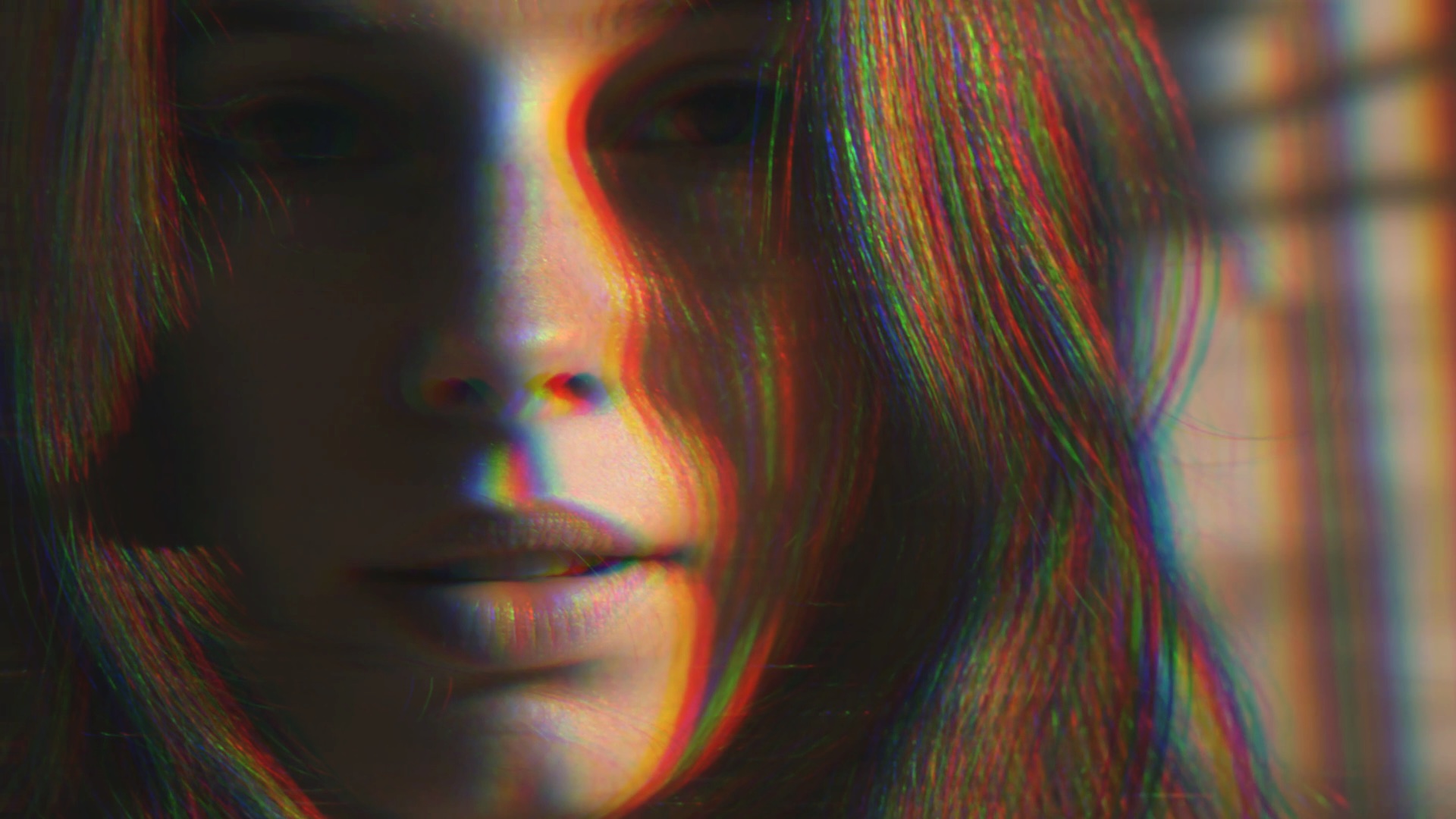
The default of 0.10 is deliberately subtle — real misregistration is a few pixels, not a rainbow. The 0.22 above is roughly the ceiling for a period look: push much past it and the channels separate far enough that it stops reading as a misaligned tube and starts reading as glitch art, which is a different look altogether. Angle rotates the axis of separation; the horizontal default is what most analog kit actually did.
Bad TV
Analog transport warble — the picture bending as though tracking is off. Two distortion controls at different scales, plus roll speed.
Roll Speed is the vertical motion — how fast the band crawls up the frame. At 0 it stops and the warp stays put, which is what you want on a still, or when the drift fights real motion in the shot.
Half these values in a stack. Bad TV and VHS both displace the image, and at full strength together the subject stops being readable — which is fine if that is the point, and a mistake if it is not.
Barrel Blur
Simulates cheap glass — radial softening and color fringing toward the frame edges. The subtlest effect here, and the one that does most to sell the others.
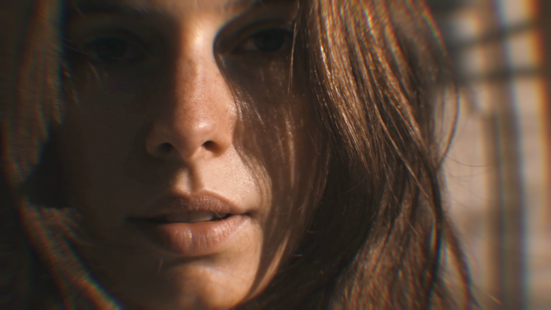
Invert pushes the blur to the center instead; Concave flips the distortion. Both worth a look, but the default outward falloff is the one that reads as a lens.
ScanLines
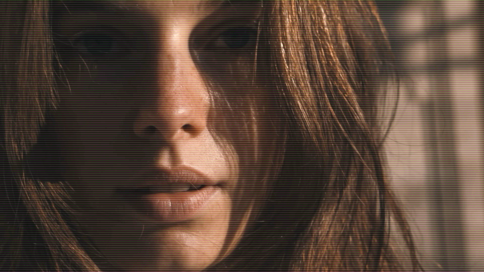
Simulates the raster of an old monitor — the horizontal lines a CRT drew the picture with, one scan at a time. The most recognizable signal that footage came off a screen rather than out of a camera, which is why it does so much for so little.
Simple to set, and the one most often dialled too fine to see.
Grain
Two effects behind one Type control: Digital is pixellated sensor noise, Film is softer and clumps like real emulsion grain.
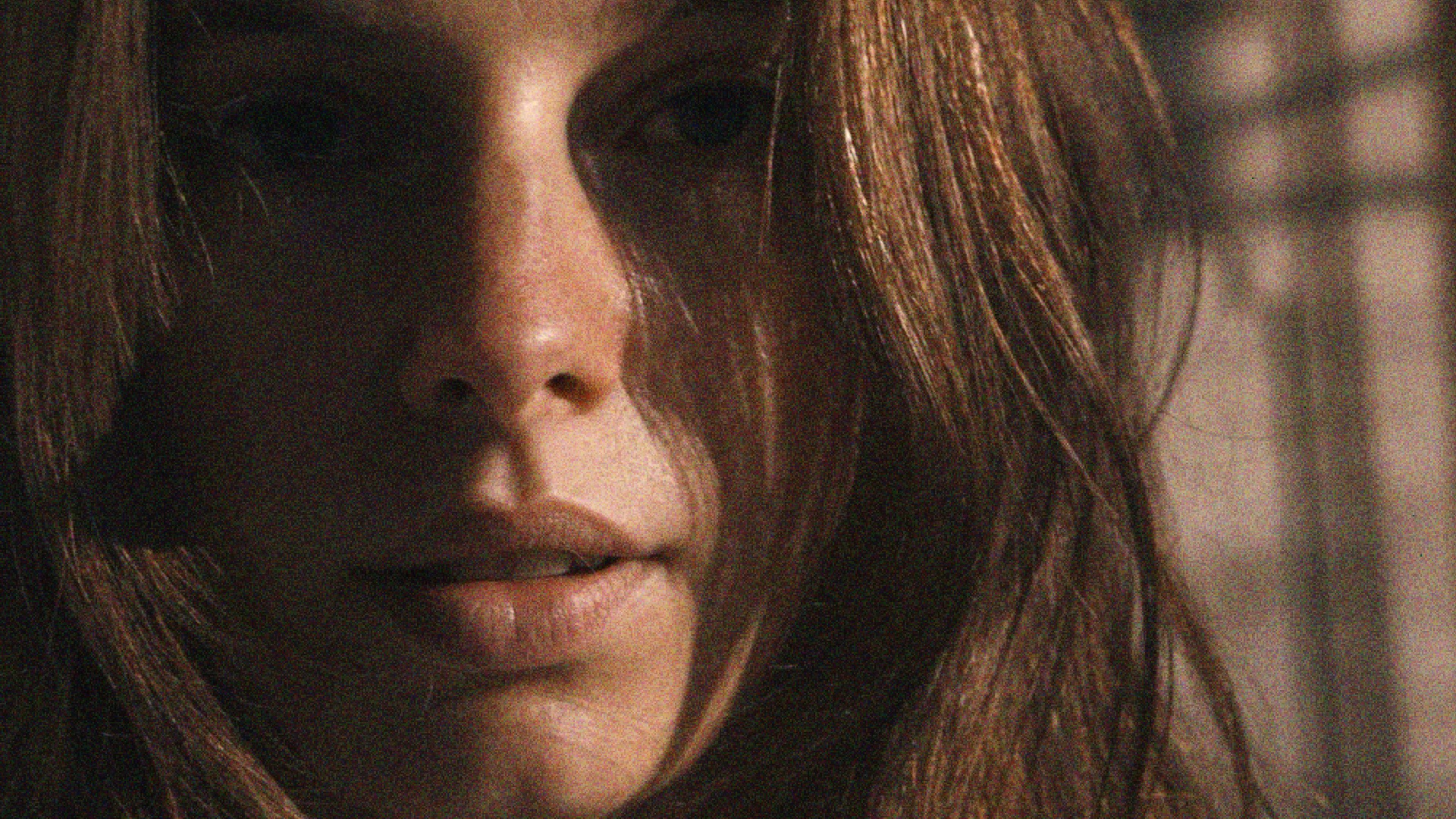
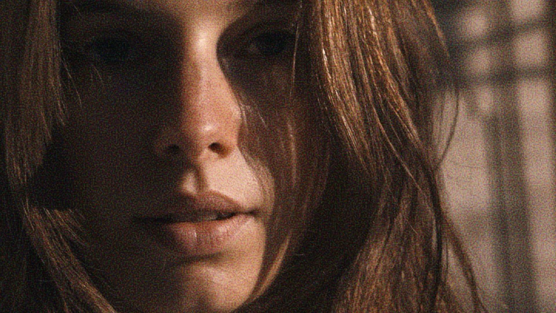
Scale sizes the grain particles and Speed controls how fast the pattern churns between frames — at zero it freezes, which looks wrong on video and is exactly right for a still. RGB toggles between colored and monochrome noise; film stock is closer to monochrome.
Stacking Them
Individually these are demonstrations; together they are a look. Read top to bottom, the order follows the path a real signal takes: the tape damages the image, the cable misregisters it, the transport warps it, the glass softens it, the screen draws it as lines, and the film records grain over everything.
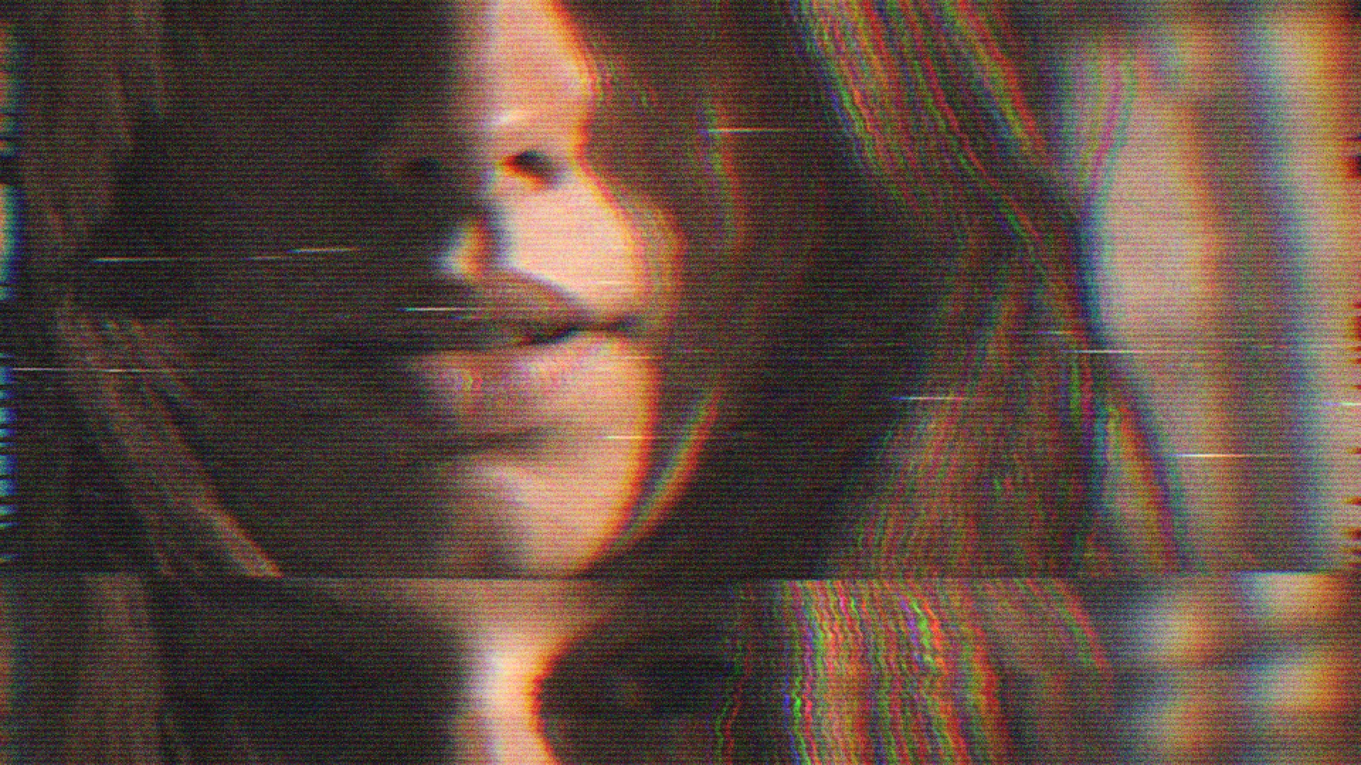
These stack well together, but less is more — in combination you can usually dial each one back from where it sat on its own.
Once dialled in, save it as a preset — controls are at the top of the effects panel. Name it, hit +, and the whole chain comes back in one click on the next clip. Presets are files, so looks can be shared both ways.
In Motion
Most of these are time-based. Dropout bars travel, the Bad TV roll crawls up the frame, grain churns. They work on a still too — the artefacts come from time, not from the input moving — but the reason to use them is what they do across frames.
Other Retro Effects
Everything so far damages the picture but leaves it the same image. These two replace the frame with their own rendering of it, so they do not layer with the rest the same way.
CRT
A whole display in one pass: phosphor triads, screen curvature and corner vignette.
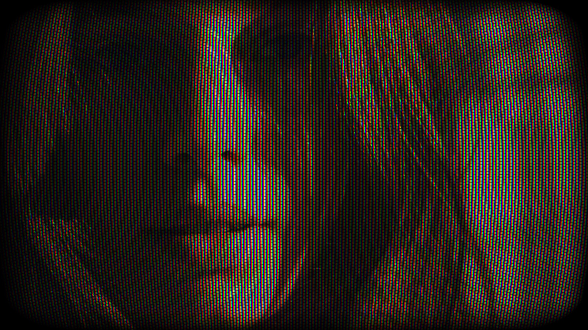
Scale is the control that matters. At the default the phosphor mask is so fine it vanishes below full resolution, which reads as broken rather than small. Push it up until you can see the structure.
Curve needs something straight in frame to read against — with no hard lines the bow is nearly invisible.
ASCII
Replaces the image with a grid of characters chosen by brightness. The most destructive effect here — it substitutes the picture rather than degrading it.
The oldest look in the set: text-only terminals and line printers drew pictures this way decades before graphics cards, and it became the house style of the dial-up BBS scene in the 80s and 90s. With Colorize on, what you get is closer to the ANSI art those boards ran than to plain ASCII.
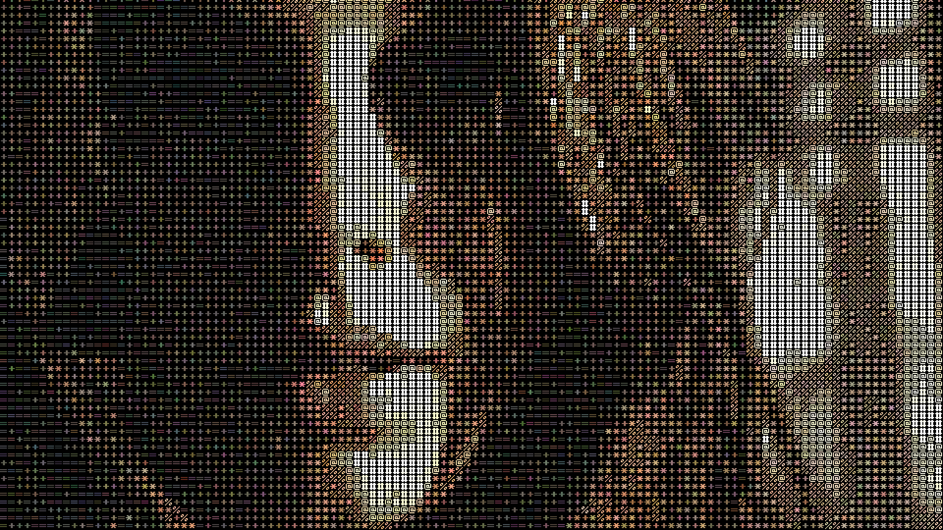
Size is the cell size; raise it if you want the characters legible rather than read as texture. Colorize tints each character from the source pixel — at zero you get monochrome.
Char Set is not just density: ramp length sets how many tonal steps you get, glyph shapes set the texture.
| Set | Ramp | |
|---|---|---|
| Barysh | .:-=+*%@# | The default. Even tonal steps, solid blacks — the safe choice. |
| Karpinsk | .°*oO@ | Round glyphs, six steps. Reads almost as halftone rather than text. |
| Okha | .:+j6bHM | Mixed weights, blockier midtones. |
| Luza | .:*o&8@# | The ramp from the original PhotoMosh. |
| Sharya | ._/:-+=()<> | Punctuation only, so it never reaches solid black. Good over dark plates. |
| Ukhta | .:^"~cvo*SO80# | Fifteen steps — the smoothest gradation before Donetsk. |
| Donetsk | .`~:;!>+=icjtJY56SXDQKHNWM | Twenty-seven steps. Holds shadow detail the short ramps crush. |
60+ Effects, Not Just These
Retro is one corner of it. Mosh-Pro ships 60+ creative effects for images and video, subtle through to destructive — Data-Mosh, Optical-Flow, Pixel Sort, Kaleidoscope, Luma-Mesh, Feedback, Soft and Hard Glitch, Super 8, Slit Scan, Dither, Watercolor, 8-Bit CGA, Light Streak, 3D Transform, ChromaKey and Remove Background, plus masking and grouping to control where any of them land.
All of it real time on the GPU, up to 4K, with audio-reactive and MIDI control if you are driving it live.